
PRACTICE DASHBOARD
Stop switching between five apps to understand your own practice.
The Carely dashboard puts everything that matters in front of you the moment you log in. Participants, revenue, open opportunities, and pipeline, so you can make decisions immediately instead of hunting for data across tools that don't talk to each other.
PRACTICE METRICS
Know the state of your practice before you've had your first coffee.
Four numbers tell you most of what you need to know to run an NDIS practice well. Active participants, revenue this month, open opportunities, and average response time. Each metric card is expandable. Click through for historical context, last month's number, year-to-date totals, and trend direction. The dashboard doesn't just show you where you are. It shows you where you're heading.
- Active Participants. Current NDIS participants in active service delivery, with month-on-month trend
- Revenue This Month, with comparison to last month
- Open Opportunities. Enquiries and potential clients in your pipeline
- Average Response Time across all channels (SMS, email, social)
- Expandable cards for historical and trend data
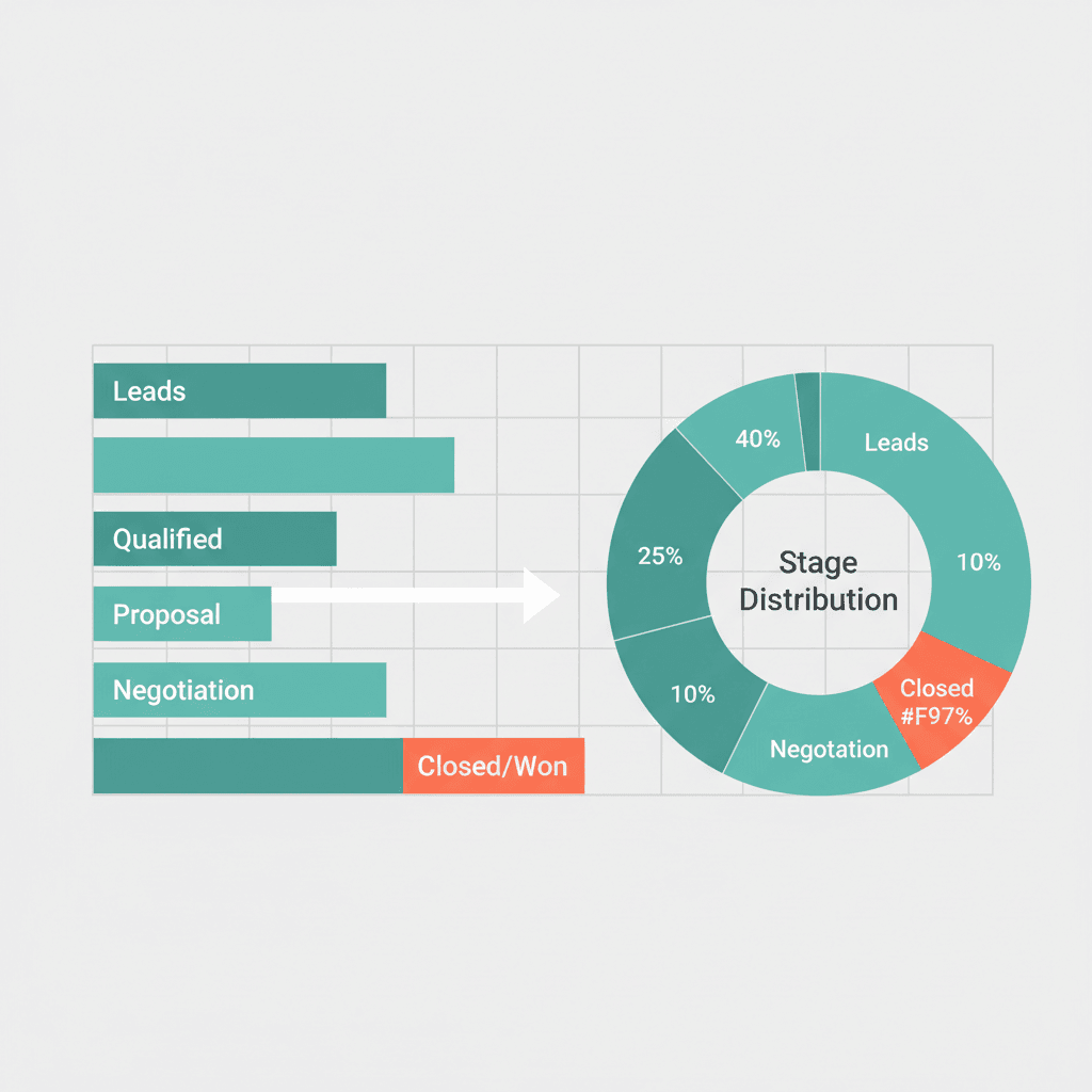
PIPELINE VISIBILITY
See every opportunity, and where it's stuck.
The Pipeline Overview shows your full funnel at a glance: how many contacts are at each stage, from new enquiry through to active client. It's the difference between knowing you have 'some enquiries' and knowing you have 24 new enquiries, 18 in initial contact, 12 with assessments booked, and 8 proposals outstanding. That specificity matters. If assessments are backing up, you know to look at capacity. If proposals are stalling, you know to follow up. The numbers update in real time as your team moves contacts through the stages.
- Stage-by-stage contact count: New Enquiry → Active Client
- Donut chart with percentage breakdown by pipeline stage
- Real-time updates as your team moves contacts through stages
- Mouse-over detail for count and percentage per stage
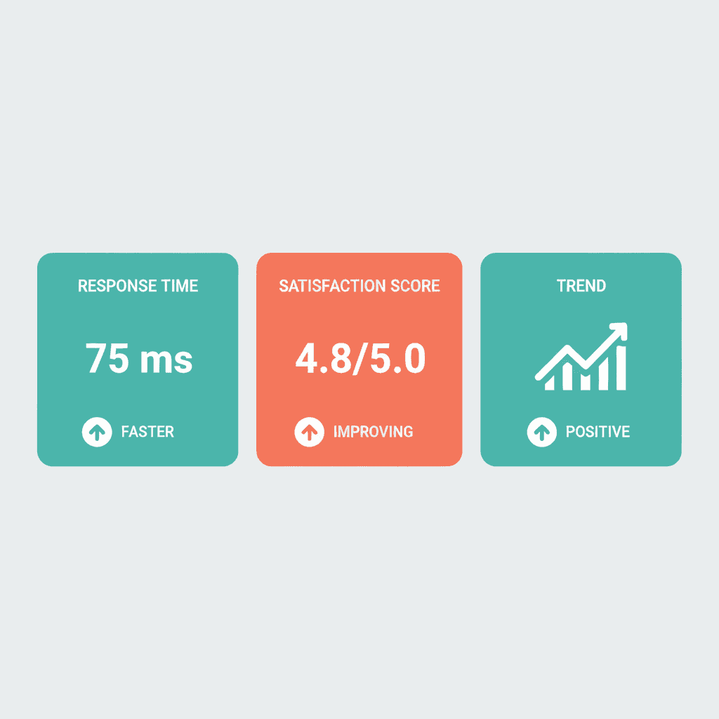
PERFORMANCE TRACKING
Performance data that's actually useful.
Average response time used to be invisible. Either you were responsive or you weren't, and nobody really measured it. Carely surfaces it as a first-class metric because it matters to NDIS participants and families more than almost anything else, and because it's something you can actually act on. See your team's average response time across SMS, email, and social channels. Set a goal. Watch it improve. Revenue tracking shows you this month versus last month, year-to-date totals, and average revenue per participant, enough context to understand whether you're growing, plateauing, or need to adjust.
- Response time tracked per channel: SMS, email, social, with target comparison
- Revenue: this month vs last month, year-to-date, and average per participant
- Trend indicators. Up/down arrows with percentage change
- Date range controls: today, this week, this month, custom period
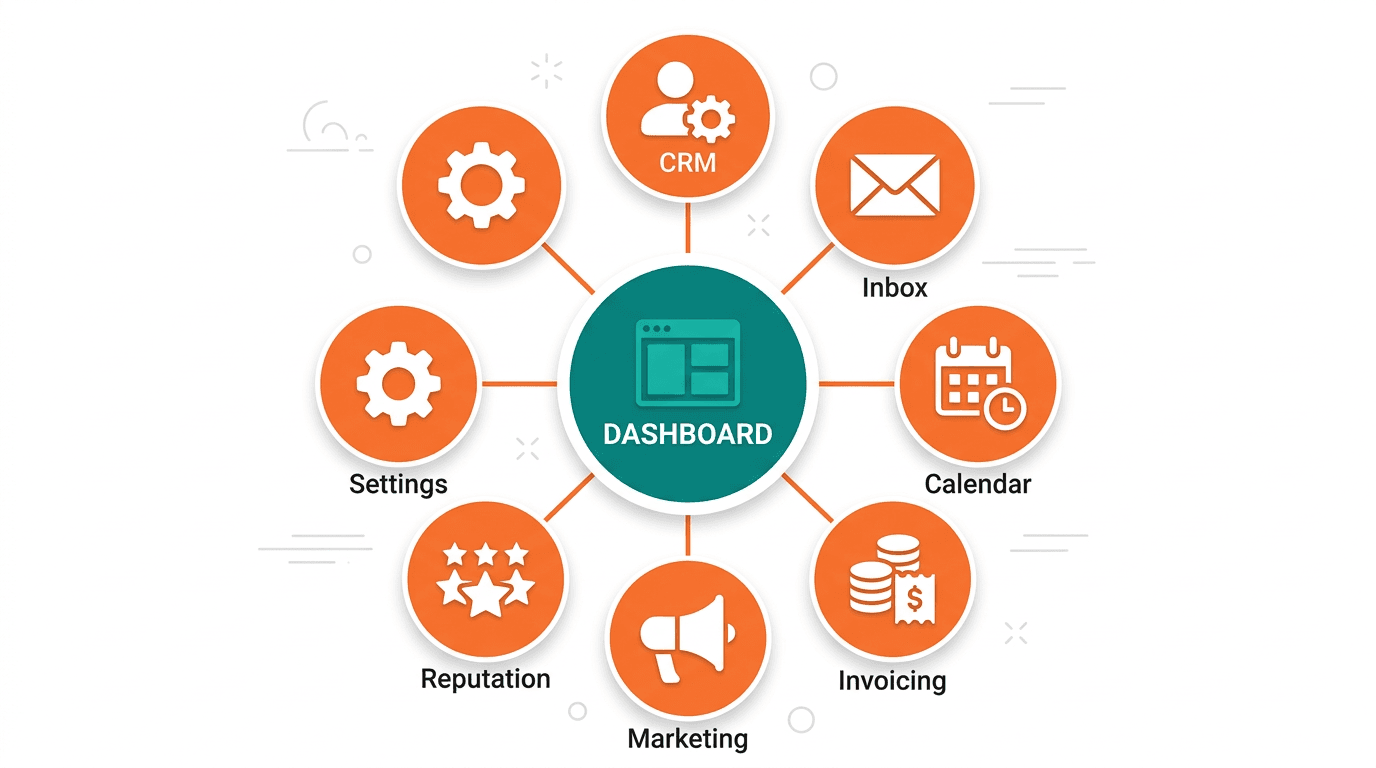
ONE UNIFIED PLATFORM
One login. Your whole practice.
The reason most practice management tools fail isn't that they're bad. It's that they only cover part of what you do. So you end up with a clinical tool, a CRM, a separate email client, a calendar app, a payment system, and three browser tabs open at all times. Carely's dashboard is the single entry point to everything: contacts, conversations, calendar, payments, marketing, reputation, and settings. Navigate from your dashboard to a participant's record, reply to a message, check an upcoming appointment, and approve an invoice, without leaving the platform or losing context.
- Navigate to any area of the platform from the sidebar without losing context
- Team management view. See what's active and outstanding across your whole team
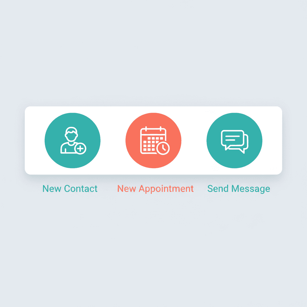
- Quick-create from any screen: new contact, new appointment, new message
- Two clicks to anything. No backtracking through nested menus
SPEED & CLARITY
Get to what you need in two clicks, not ten.
The dashboard is designed for speed. From any screen, you're never more than two clicks from creating a new contact, booking an appointment, or sending a message. Date range controls let you adjust what the dashboard shows: today, this week, this month, or a custom range. For busy practice managers, a dashboard that slows you down is worse than no dashboard at all. Carely is built for the two-minute Monday morning check-in: open it, understand the state of your practice, close the laptop, and go see clients.
- Quick-action buttons available from every screen in the platform
- Date range picker: today, week, month, custom. Compare any periods
- Monday morning check-in mode: open it, understand your practice, close it in under 5 minutes
- Fast sidebar navigation. Never more than one click to any section

Ready to see your whole practice in one place?
Book a 30-minute demo and we'll show you what a Carely dashboard looks like for your practice: participants, pipeline, revenue, and response time all in one view.